Chapter 05
Composition
10 lessons on composition, guiding attention, and exercises for a camera or phone.
Compose intentionally and explain why a frame succeeds.
7-day challenge · A 12-image composition series. Use a phone or camera; allow 20–40 minutes per day and split sessions as needed. Day 1: select a thirds image and a leading-line image. Day 2: select a frame-within-a-frame image and a symmetry image. Day 3: select a negative-space image and a three-layer depth image. Day 4: select asymmetric balance with repetition and an odd-numbered group with a focal point. Day 5: select a phi-grid or spiral image and a diagonal, S-curve, or triangle image. Day 6: select a filled frame with a clean background and deliberate rule-breaking. Day 7: review all 12 images as thumbnails, ask a viewer to identify the first point of attention before reading your notes, and reshoot two unclear images. Deliverables: 12 final images, two before–after pairs, and one explanatory sentence per image. Score each frame 0–2 for subject clarity, intentional eye path, clean background and edges, and composition serving the message. Practice target: at least 9/12 images reach 6/8; revise weaker images before marking completion.
Lesson 01
The Rule of Thirds
Divide the frame into a 3×3 grid and place important subjects or lines near intersections to create balanced off-center composition. The grid is a starting point for seeing relationships between subject and space, not a scoring system. For portraits, eye position and look-room matter more than forcing shoulders onto a grid line. For landscapes, give more area to the part with stronger content: an expressive sky or a textured foreground.

Key takeaways
- Placing portrait eyes near an intersection can create natural off-center balance
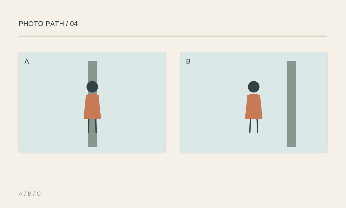
- Put the horizon high or low according to which half contains more meaning
- Leave space in the direction of gaze or movement when you want visual ease
- A bright, colorful, or secondary element can balance a subject on the opposite side
- Centered composition is often stronger for symmetry, confrontation, or stillness
- Content and intention take priority over exact grid placement

Practical example
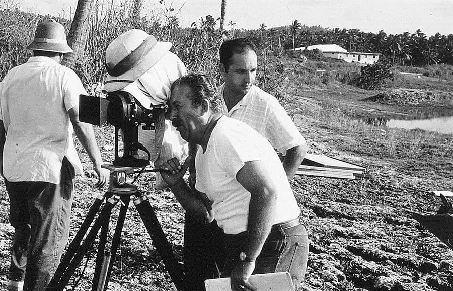
Place a person on the left third and leave space to the right where they are looking. The gaze carries the viewer into the open area. Reducing that look-room can create pressure or suggest that the person is leaving the frame. Both choices can work when their emotional effect matches the story.
Common mistakes
- Forcing every subject onto an intersection
- Cropping too aggressively just to hit the grid
- Leaving space behind the subject instead of ahead without a reason
- Placing the horizon on a third while ignoring edge distractions
- Using the grid before deciding what the subject actually is
Knowledge check
Lesson 02
Leading Lines, Frames within Frames, and Symmetry
Lines may be literal—roads, rails, corridors, or shadows—or implied through gaze, gesture, and repeated objects. A frame within the frame uses doors, foliage, darkness, or light to isolate the subject. Symmetry relies on an axis or center and makes small alignment errors obvious. These structures work only when they lead toward meaningful content. A powerful line that exits the frame or ends nowhere may compete with the intended subject.

Key takeaways
- Identify both the starting point and destination of every strong line
- Diagonals create energy, horizontals suggest stability, and curves guide the eye gradually
- Doors, windows, shadows, and branches can provide depth and isolation
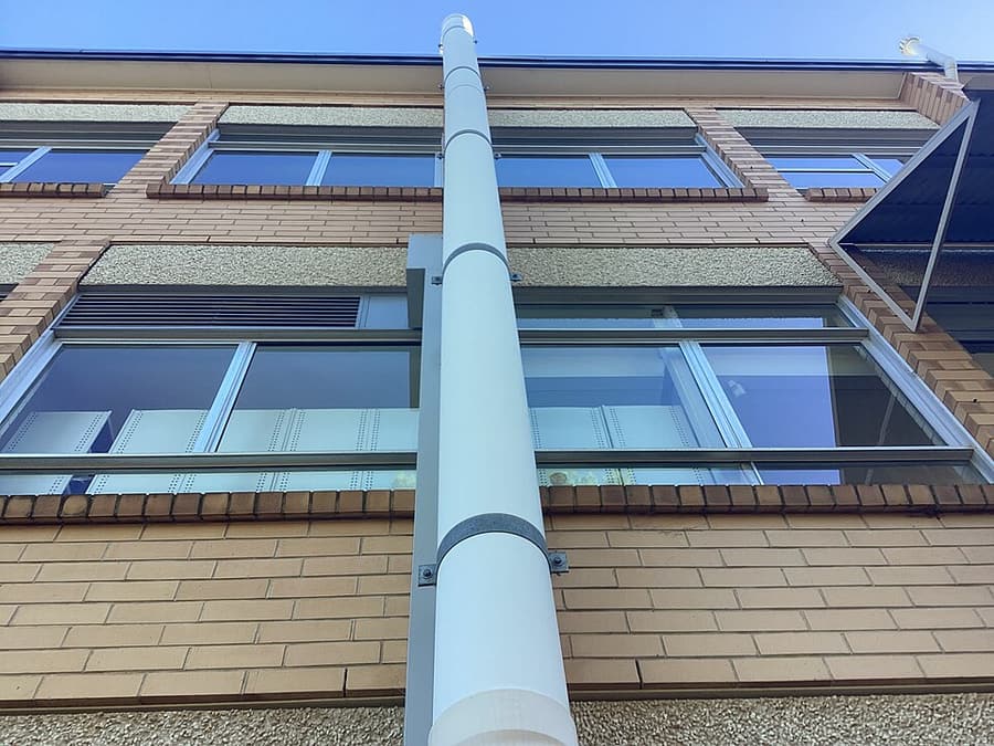
- A lower or higher viewpoint can strengthen convergence
- Symmetry requires precise camera centering and level alignment
- Implied lines from eyes and gestures can be stronger than physical edges
- Center composition places the subject on the middle axis for directness and stability; the surrounding scene need not be symmetrical. For symmetry, align the camera to the axis, compare side margins and verticals, and make any small asymmetry intentional because it attracts attention.
Practical example
In a symmetrical corridor, stand exactly on the center axis, level the camera, and wait for a person to enter the vanishing point. Moving only a few centimeters changes the side spacing. If the person does not separate at the destination of the lines, the structure may overpower them.

Common mistakes
- Letting leading lines carry attention out of the frame
- Allowing a line to cut through a head or joint awkwardly
- Using a heavy foreground frame that hides the subject
- Making symmetry almost—but not intentionally—aligned
- Combining so many lines and frames that the eye has no priority

Knowledge check
Lesson 03
Negative Space and Minimalism
Negative space is an area of low information around the subject. It may be sky, water, a wall, darkness, or a softly focused field. Its shape and proportion give the image breathing room and can suggest isolation, freedom, fragility, quiet, or scale. Minimalism demands precision. When only a few elements remain, every line, bright spot, color, and distance to the edge becomes more visible. Move the camera to simplify before depending on cropping later.

Key takeaways
- Negative space is designed space, not merely unused background
- Its direction should relate to gaze, motion, or emotional pressure
- Contrast in tone, color, sharpness, or silhouette helps a small subject remain visible
- A tiny bright detail can carry more visual weight than a large quiet area
- Check all four edges because small intrusions become prominent
- Removing an element is useful only when the message becomes clearer
Practical example
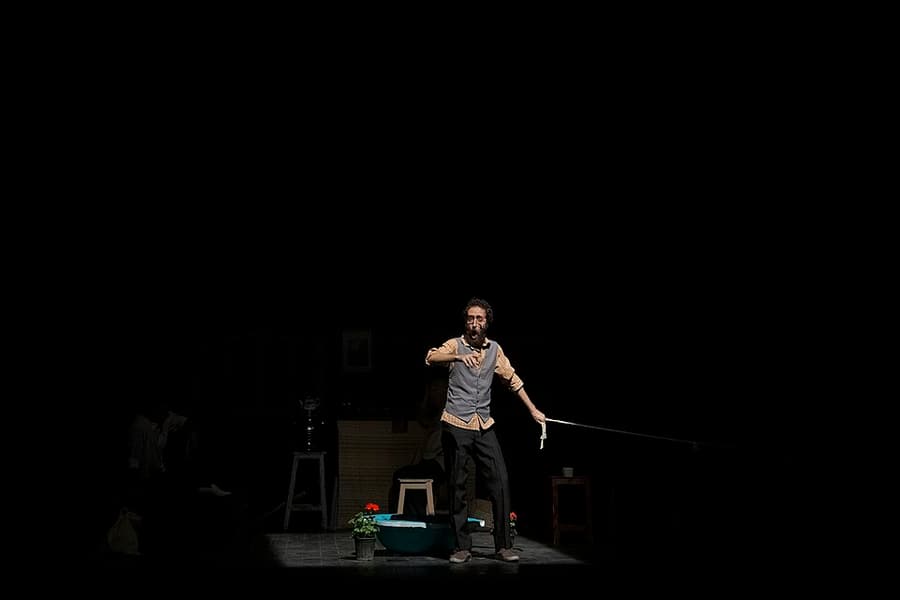
A bright figure occupying 5–10% of a dark wall can still be the first point of attention. A small bright sign on the opposite edge may destroy the quiet balance even though it occupies little area. A slight change in camera position may remove it more naturally than retouching.

Common mistakes
- Confusing an accidental empty background with intentional negative space
- Placing a subject against the edge they are looking toward without purpose
- Leaving a bright distraction inside the quiet area
- Cropping widely without designing the shape of the space
- Equating minimalism with missing context or weak subject emphasis
Knowledge check
Lesson 04
Foreground, Middle Ground, and Background
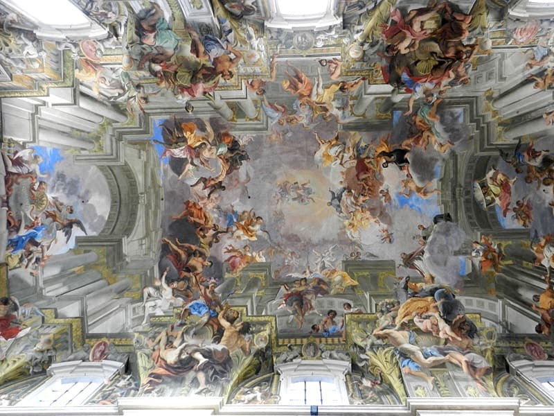
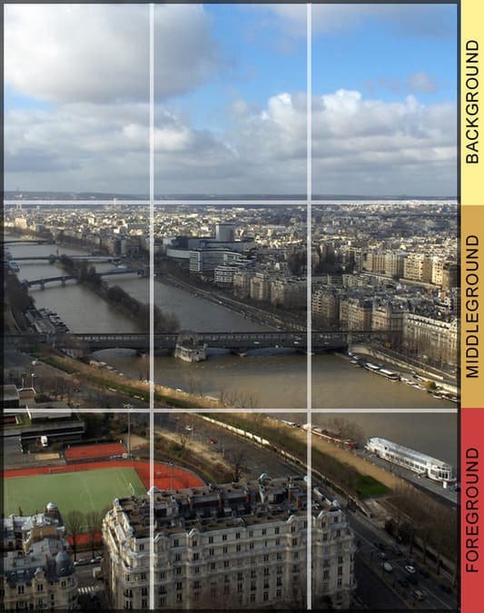
Depth can be suggested through overlap, linear perspective, relative size, atmospheric contrast, warm–cool color, and focus. Foreground offers an entry point, middle ground often carries the action, and background locates the subject within a larger place. The three layers do not need equal sharpness or brightness. Use aperture, contrast, and light to create hierarchy so the primary layer is easy to read and supporting layers add context without competing.

Key takeaways
- A purposeful foreground gives the eye an entry into the scene
- Slight overlap helps the viewer understand which object is closer
- Wide focal lengths and close foregrounds exaggerate apparent depth
- Cool color, haze, and lower contrast often make a background recede
- Separation between silhouettes prevents layers from merging into confusing shapes
- Every layer should add information or mood rather than simply fulfilling a formula
- Foreground framing uses a branch, doorway, or near object as a frame; it must lead to the subject rather than merely cover the image edge
Practical example
A branch near the lens can become a soft foreground, a walking person the middle ground, and mountains the background. Lowering the camera a few centimeters may separate the person's silhouette from the mountain ridge. If the branch covers the face or becomes the brightest element, it blocks rather than guides the view. When shooting through a window, doorway, or foliage, choose an opening around the subject and check that the frame does not cut into a head, hand, or horizon. A small change in camera position can make foreground feel like an invitation into the scene rather than an obstruction.

Common mistakes
- Adding a foreground object that has no relationship to the story
- Letting foreground and subject touch in awkward tangencies
- Giving every layer equal brightness, sharpness, and detail
- Stopping down automatically until the hierarchy disappears
- Using a foreground so large that it competes with the subject
Knowledge check
Lesson 05
Visual Balance, Rhythm, and Pattern
Visual weight increases when an element is large, bright, sharp, saturated, high-contrast, or far from the center. Faces and text also attract attention strongly. Balance does not require matching halves: one vivid object can balance several quieter objects or a large dark mass. Pattern creates expectation through repeating shapes, colors, or spacing. A single break becomes a focal point only when the viewer first recognizes the underlying order.

Key takeaways
- Bright regions and saturated colors carry strong visual weight
- Elements near the edge create more tension and leverage than those near the center
- Faces, eyes, and text may outweigh physically larger objects
- Balance may be symmetrical or asymmetrical
- Even spacing creates steady rhythm; changing spacing can accelerate or slow it
- A pattern break needs enough surrounding repetition to be understood
- Reflections in water, glass, or mirrors can create strong symmetry; check the dividing line, surface cleanliness, and whether the inverted subject still reads clearly

Practical example
One person in red on the left may balance three smaller, darker people on the right. If the red clothing becomes gray, the left side loses weight even though physical size is unchanged. Moving the person farther from center or waiting for a highlight can restore balance. For a reflection, lower the camera to enlarge the water or mirror, then choose whether the symmetry line should sit centrally or off-center to emphasize the subject. Wind, ripples, and dirty glass can break symmetry, but can also make the reflection an abstract layer when the main subject remains clear.

Common mistakes
- Judging balance only by physical size or object count
- Ignoring a small highlight or text near an edge
- Making both sides equal when the image needs energy or tension
- Creating a pattern with no point of emphasis or meaning
- Breaking a pattern in several places until the pattern is no longer legible
Knowledge check
Lesson 06
Breaking Composition Rules Deliberately
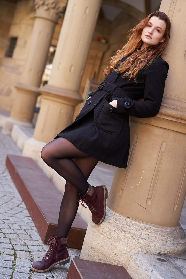
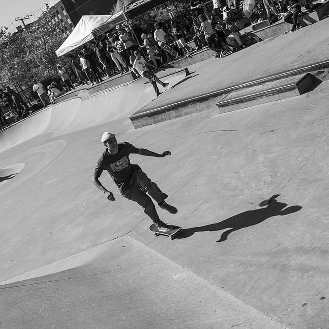
Composition rules describe relationships that often work; they are not universal scoring criteria. Breaking one meaningfully requires understanding the expectation it creates and choosing a different effect—tension, confrontation, speed, confinement, imbalance, or uncertainty. Intent becomes easier to read when the departure is clear and consistent. A slightly tilted horizon may look careless; an obvious Dutch angle repeated through a series can communicate instability.
Key takeaways
- Name the rule and the expectation you are departing from
- Give the departure a specific visual or narrative reason
- Make the change strong enough to read as a choice rather than a small error
- Keep focus, timing, and frame edges controlled
- Compare a conventional version with experimental alternatives
- Test whether viewers feel the intended effect without first hearing your explanation
Practical example
Centering a face can create direct confrontation; cutting the top of the head can emphasize the eyes. Leaving little space in front of a runner can make the frame feel blocked. That may suit a story about pressure but contradict a story about freedom. The same “broken rule” succeeds or fails according to message.

Common mistakes
- Calling an accidental composition an intentional rule break
- Breaking several rules simultaneously until the viewer has no anchor
- Choosing the strangest version instead of the clearest one
- Failing to make a conventional comparison frame
- Defending the choice only through personal taste, without describing its effect

Knowledge check
Lesson 07
The Golden Ratio and Spiral
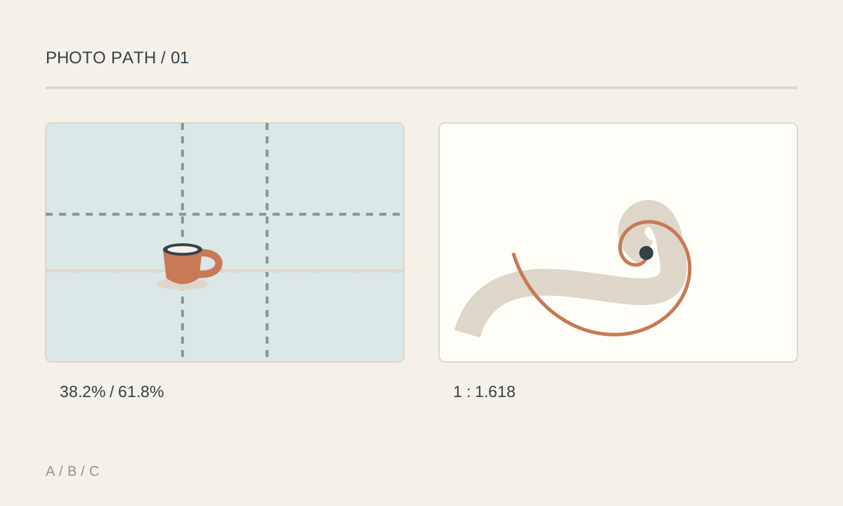
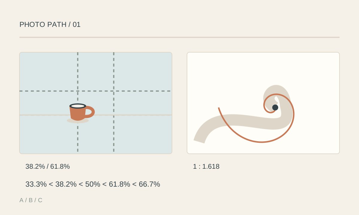
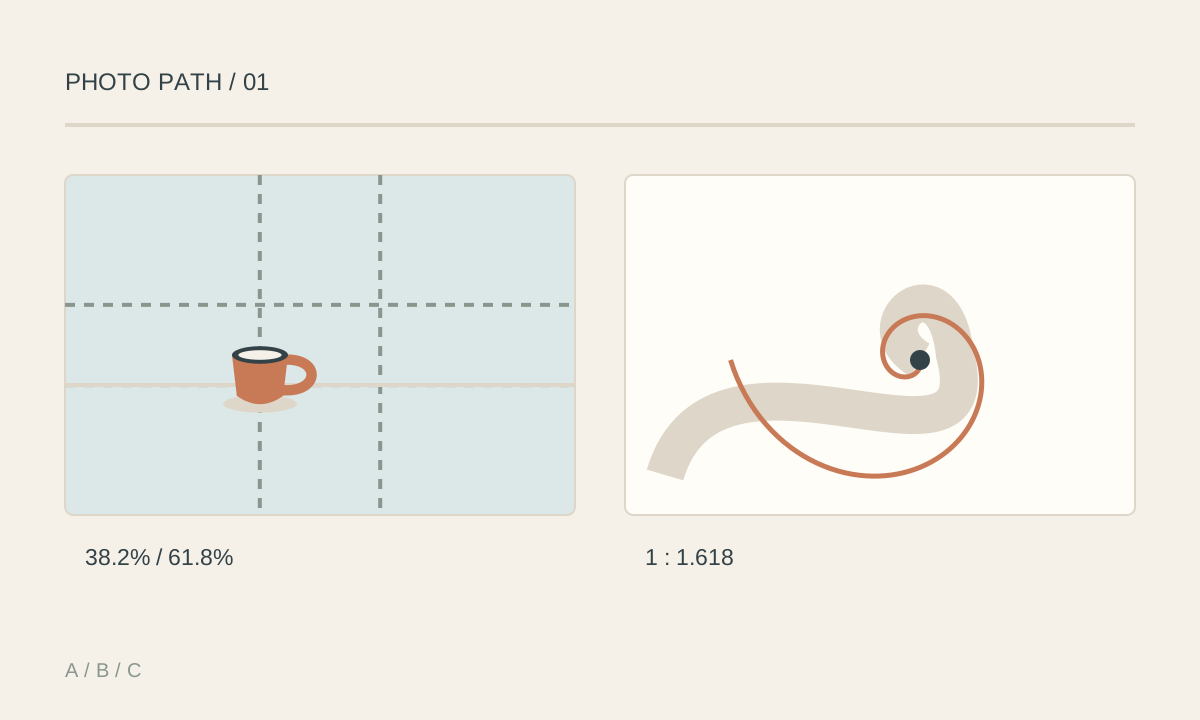
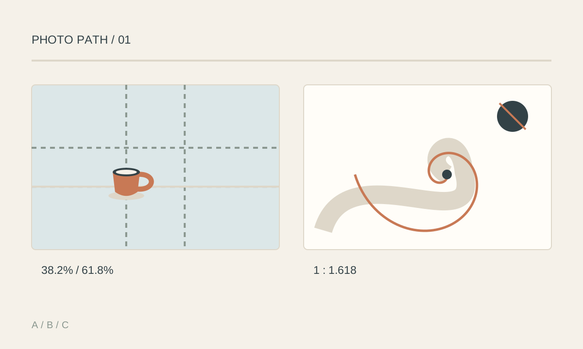
The golden ratio is a relationship of approximately 1:1.618 between two lengths. A phi grid places divisions near 38.2% and 61.8% of the frame's width and height, closer to the center than a thirds grid. Use it to explore a less strongly off-center subject or horizon. A golden spiral suggests a journey from a broad area toward a small area containing the focal point. A coastline, stair rail, or arrangement of objects may support that journey. A curved scene does not automatically follow the golden ratio, and matching an overlay does not guarantee a stronger photograph. You do not need to calculate while shooting. Identify the subject, observe the lines, and leave enough room to compare crops later. A phi grid and a spiral are different guides: placing a subject at a grid intersection does not create a curved path through the image.
Key takeaways
- Phi-grid divisions lie near 38.2% and 61.8%, closer to the center than thirds
- The focal point should remain clear after the overlay is hidden
- A spiral is useful when actual lines or arrangements support the intended eye path
- Rotate or flip a guide to explore the direction already present in the scene
- A 3:2, 4:3, or 16:9 frame is not automatically a golden rectangle; do not stretch an image to force a match
- Choose the frame that communicates best, even when it does not follow the golden ratio
Practical example
Photograph a coffee cup at the end of a curve made by a tablecloth. Place the cup near a thirds intersection in one frame and near 38% of the width in another. Check whether the cloth leads toward the cup or away from it, then choose the more useful relationship between subject and space. For a curved staircase, find a position where the rail leads toward a person. Do not crop out a meaningful hand or make the person unreadably small just to match a spiral overlay.
Common mistakes
- Claiming that the golden ratio always produces better images
- Adding a spiral to any curve without checking where the eye goes
- Confusing a phi grid with a thirds grid
- Removing essential context or stretching the image to fit a diagram
- Letting a bright area outside the intended path become the main attraction
Knowledge check
Lesson 08
Diagonals, S-Curves, and Triangles
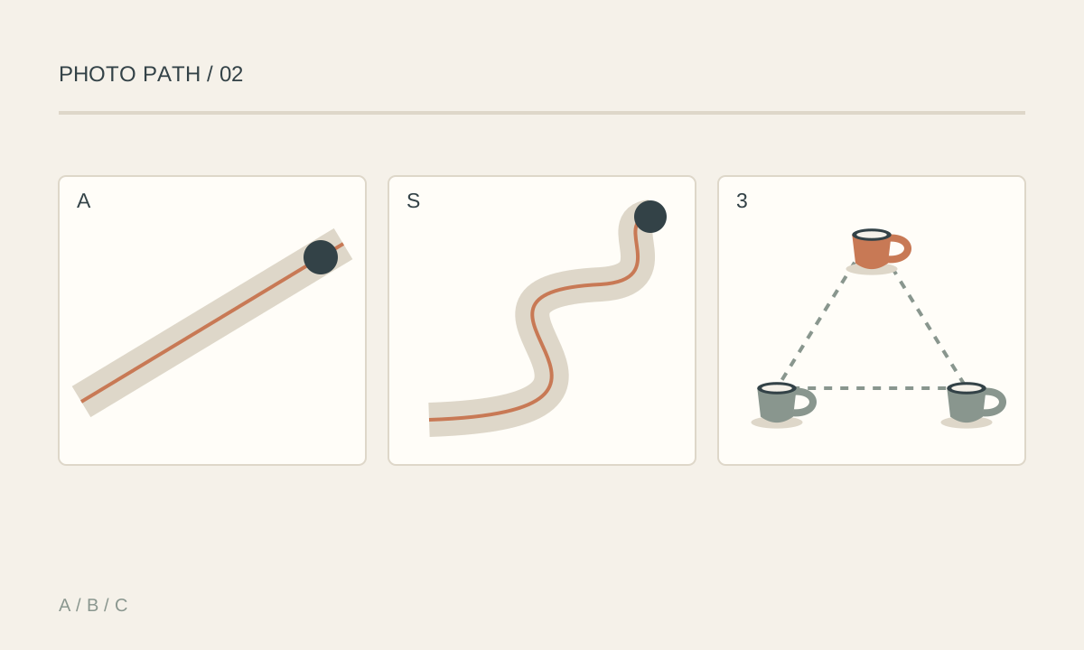
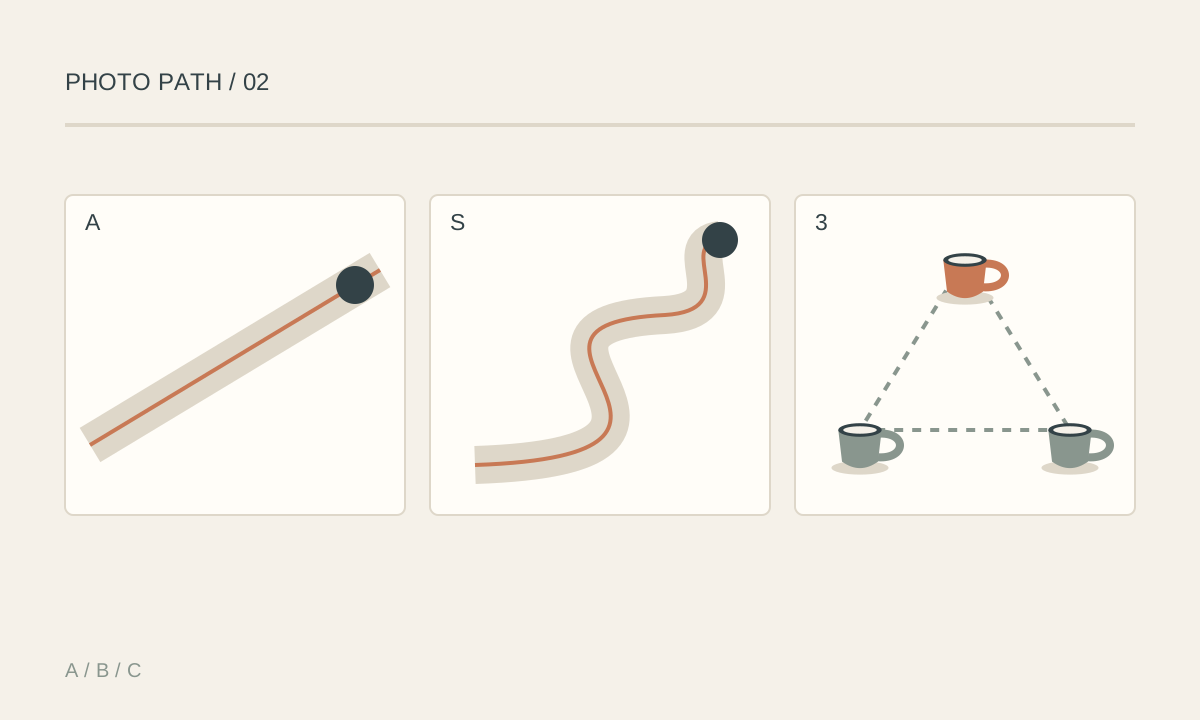
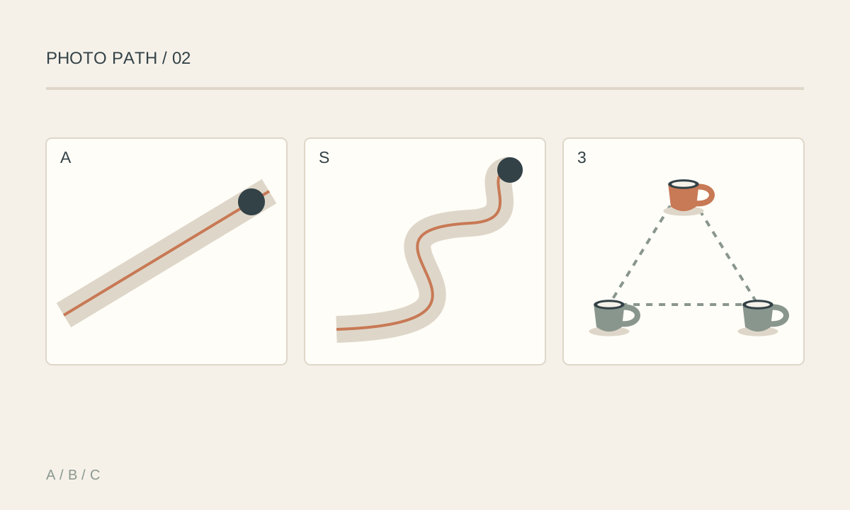
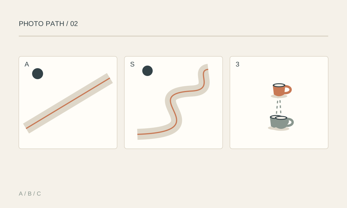
Diagonals can suggest motion, an S-curve can carry attention through a winding route, and three points forming a triangle can connect subjects into a group. These are relationships within the frame; you do not need a literal triangular object. Three faces, three bright areas, or a head and two hands can imply a triangle. A horizontal base may suggest stability, while a tilted or downward-pointing triangle may create tension. The effect also depends on content, light, and spacing. Explore these structures by changing camera position. A table edge, rail, or arm can form a diagonal while the horizon stays level; tilting the camera is optional, not a requirement.
Key takeaways
- Diagonals can come from objects, shadows, or movement
- An S-curve needs a readable entrance, route, and meaningful stopping point
- Three distinct points can imply a triangle without connecting lines
- Changing camera height or position can reveal geometry more clearly
- Strong lines should support the subject rather than cut a face or lead out of the frame
- One readable structure is often more effective than competing paths
Practical example
A winding path from a lower corner toward a distant person may form an S-curve. A slightly higher viewpoint can separate the bends. Wait until the person's outline is distinct from the trees behind them. Arrange three lemons into a triangle instead of a row. Let the main lemon stand out slightly and choose a viewpoint that separates all three outlines. From too low a position, the rear lemons may overlap and hide the triangular relationship.
Common mistakes
- Tilting the camera without first looking for diagonals in the scene
- Using an obscured S-curve or one that ends at an unimportant area
- Letting three points overlap until the triangle becomes unreadable
- Running a strong line through eyes, a head, or a joint
- Adding so many lines that the viewer cannot choose a path
Knowledge check
Lesson 09
The Rule of Odds and Subject Grouping
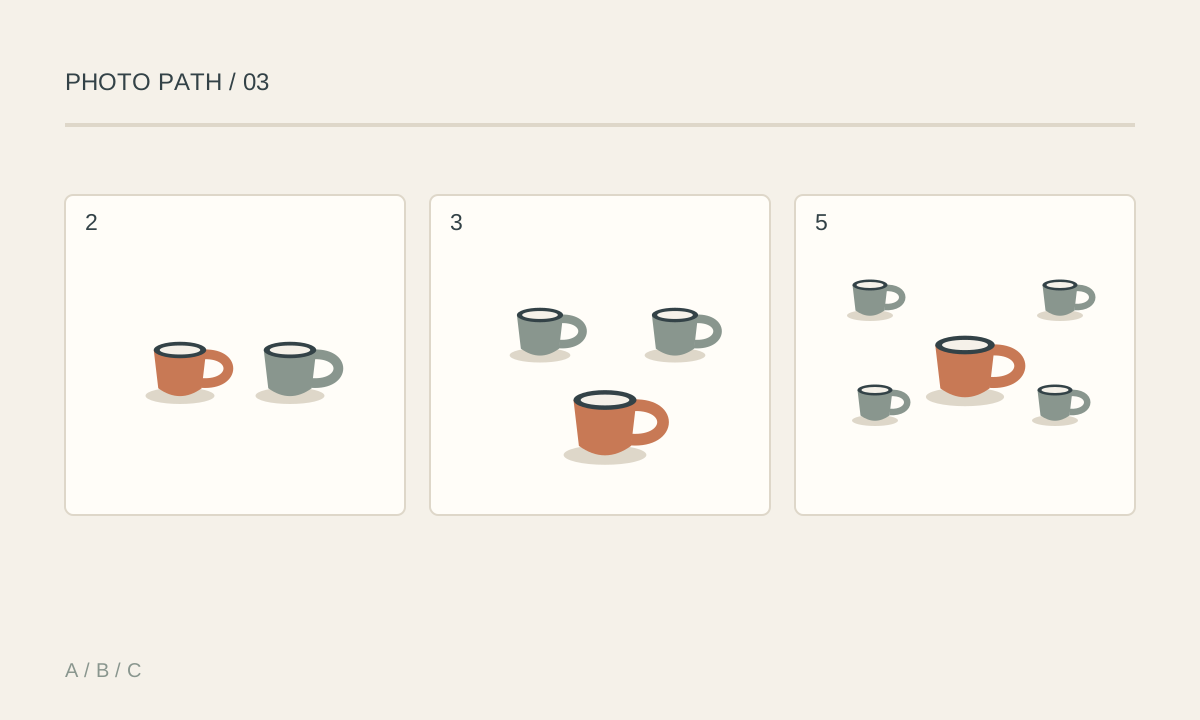
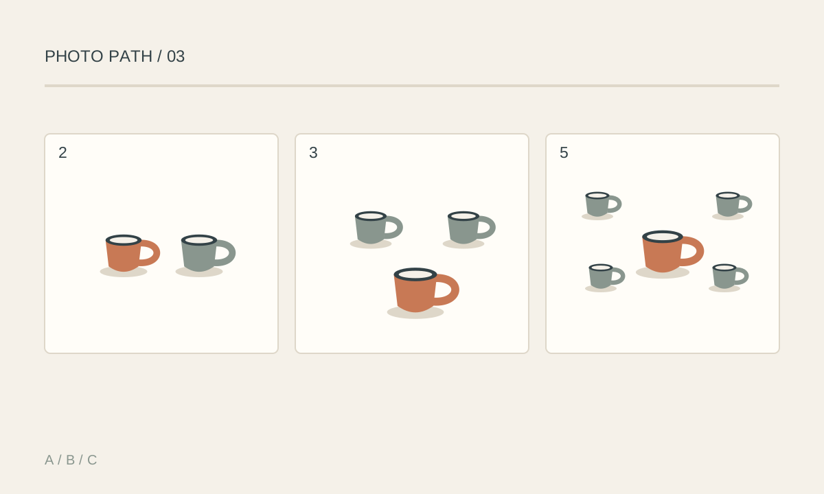
A group of three or five elements can help establish a focal point with supporting elements around it. The rule of odds is a suggestion for exploring relationships, not proof that every odd-numbered group is stronger than an even-numbered one. Two elements can communicate partnership, dialogue, or opposition. Four can emphasize regular rhythm or symmetry. Let the story determine the number. When many objects read as a mass or pattern, spacing, rhythm, and an exception are usually more useful than counting. You can arrange a still life yourself. In everyday scenes, observe and wait for people to separate visually. Do not remove a person from a documentary image just to produce an odd number.
Key takeaways
- Try three or five elements when exploring a focal point with supporting objects
- Odd numbers do not create hierarchy on their own; light, size, and position still matter
- Spacing and overlap affect whether elements read as a group
- Two or four elements can support partnership, dialogue, or regular rhythm
- For a dense pattern, prioritize rhythm and an exception over counting
- Preserve documentary truth; explore viewpoint and timing in the actual scene
Practical example
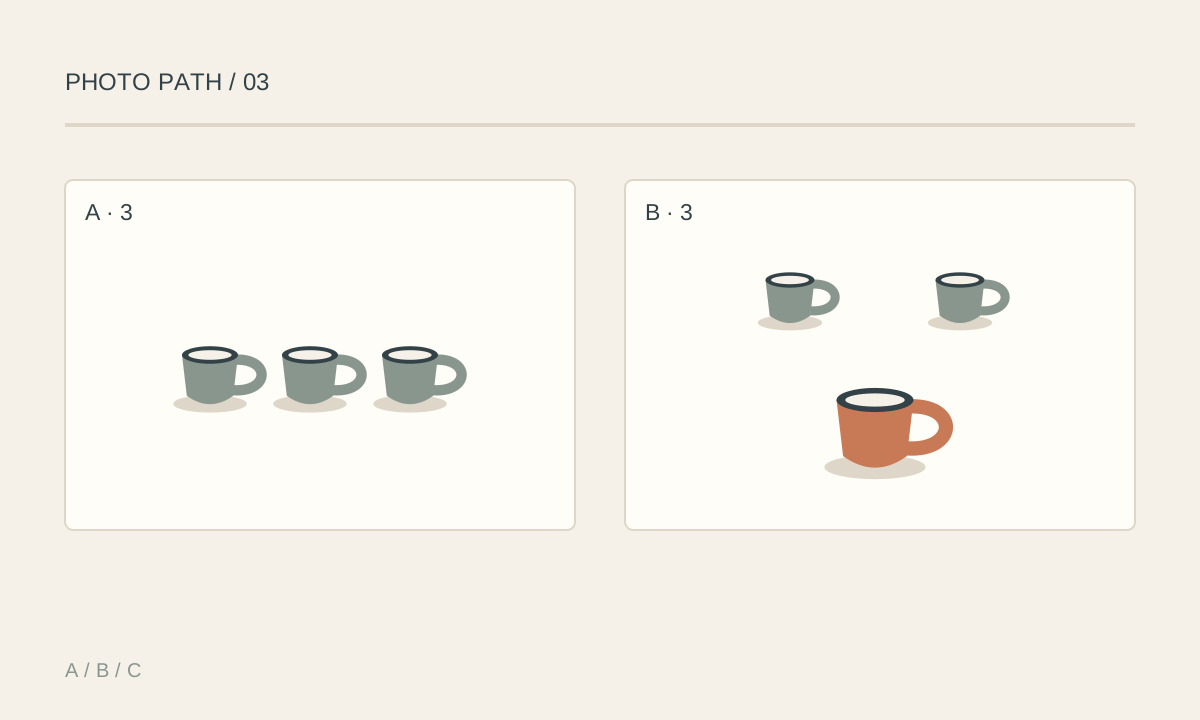
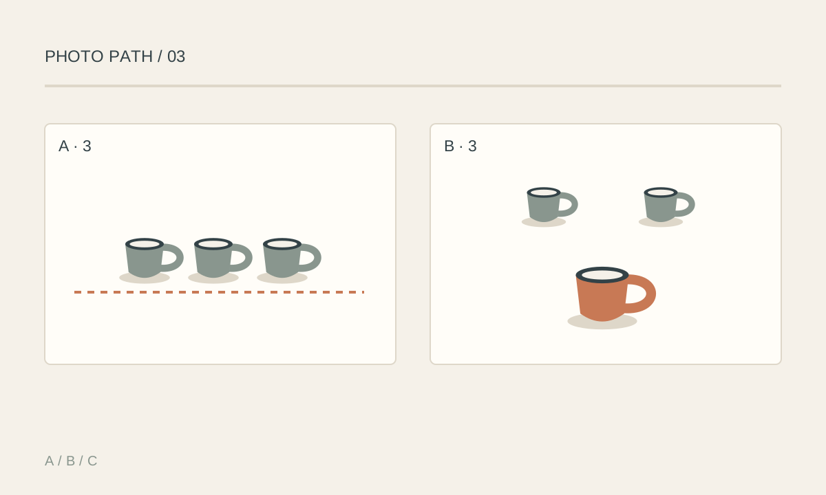
Photograph three cups with the main one forward and the others behind it, slightly less prominent. If all three are equally bright, equally large, and evenly spaced, the viewer may see a row rather than a main cup. For a story about breakfast for two, two cups may work better than three. Adding a cup just to obey the rule can weaken the original meaning.
Common mistakes
- Adding or removing objects solely to get an odd number
- Assuming three equally prominent subjects automatically create a focal point
- Letting outlines merge so individual objects are hard to identify
- Applying odd-even counting mechanically to crowds or dense patterns
- Removing people from a documentary photograph to change composition
Knowledge check
Lesson 10
Fill the Frame and Separate Subject from Background
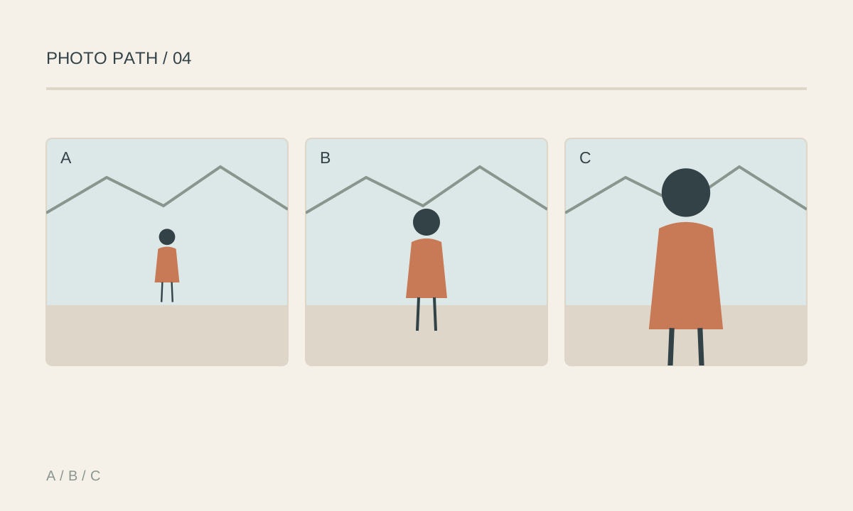
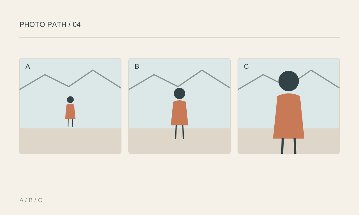
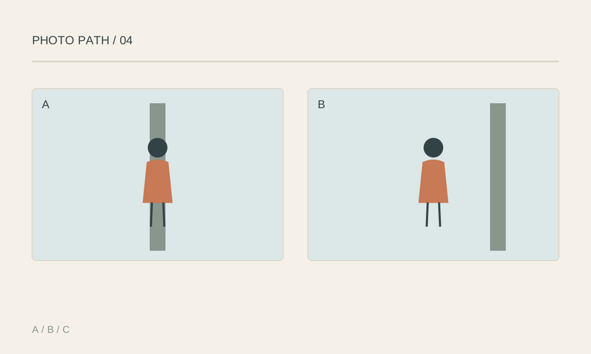
Filling the frame makes detail, expression, or texture the main content. Separating the subject from the background makes its shape readable through outlines, brightness, color, or focus. Both approaches can work without expensive lenses. Before zooming, move sideways or change camera height to choose the background. A small step can remove a pole that appears to grow out of a head, avoid a horizon through the eyes, or place a bright subject against a dark area. Background blur does not fix every merged outline. Moving closer changes perspective; zooming from the same position mainly changes framing. For portraits, avoid moving extremely close with a wide-angle camera unless you intend to exaggerate nearby features. A wide frame remains useful when location and surroundings contribute to the story.
Key takeaways
- Compare wide, medium, and close frames to decide how much context matters
- Choose the background through camera position before relying on blur
- Inspect the head, shoulders, and frame edges for accidental tangencies
- Brightness or color contrast can separate a subject without a wide aperture
- Moving closer changes perspective; zooming in place does not create the same near-far relationships
- Crop deliberately, avoiding joints and essential storytelling details
Practical example
Photograph a flower seller. A wide frame shows the stall and market atmosphere, a medium frame clarifies the person and bouquet, and a close frame emphasizes hands tying a ribbon. Choose distance according to the information needed, rather than assuming that closer is always stronger. If a pole touches the top of the seller's head, move sideways and inspect the hair, bouquet, and edges again. Then explore aperture or portrait mode if less background detail would help.
Common mistakes
- Zooming so tightly that necessary context or hands are lost
- Using a wide-angle camera very close to a face without checking perspective
- Increasing blur while subject and background outlines still merge
- Ignoring bright distractions at the edges
- Assuming a close image is always better than a wide one